Data Visualizations and Visual Storytelling
Good visualizations transform data into insights and stories into understanding. They serve as a universal language that can communicate complex ideas quickly and clearly. Whether you’re creating diagrams for technical documentation or charts for business presentations, the key is matching your visual vocabulary to your message.
- Visual Vocabulary
- Stories and Actions, Not Just Data
- Choosing the Right Chart Type
- Resources and Tools
Visual Vocabulary
Diagrams are a vocabulary unto themselves. The right visual metaphor can make complex concepts immediately understandable, while the wrong choice can confuse even simple ideas.
Key principles for effective diagrams:
- Consistency - Use the same symbols and styles throughout
- Clarity - Each element should have a clear purpose
- Context - Provide enough background without overwhelming
- Hierarchy - Guide the eye to what matters most
For more detailed exploration of visual vocabulary concepts, see my technical notes on visual vocabulary.
Stories and Actions, Not Just Data
The most powerful visualizations don’t just present data—they tell a story that leads to action. Raw numbers are ingredients; insights are the finished meal.

This progression from data to wisdom shows why visualization matters:
- Data - Raw facts and figures
- Information - Processed data with context
- Knowledge - Information combined with experience
- Wisdom - Knowledge applied to make decisions
Examples of storytelling through visualization:
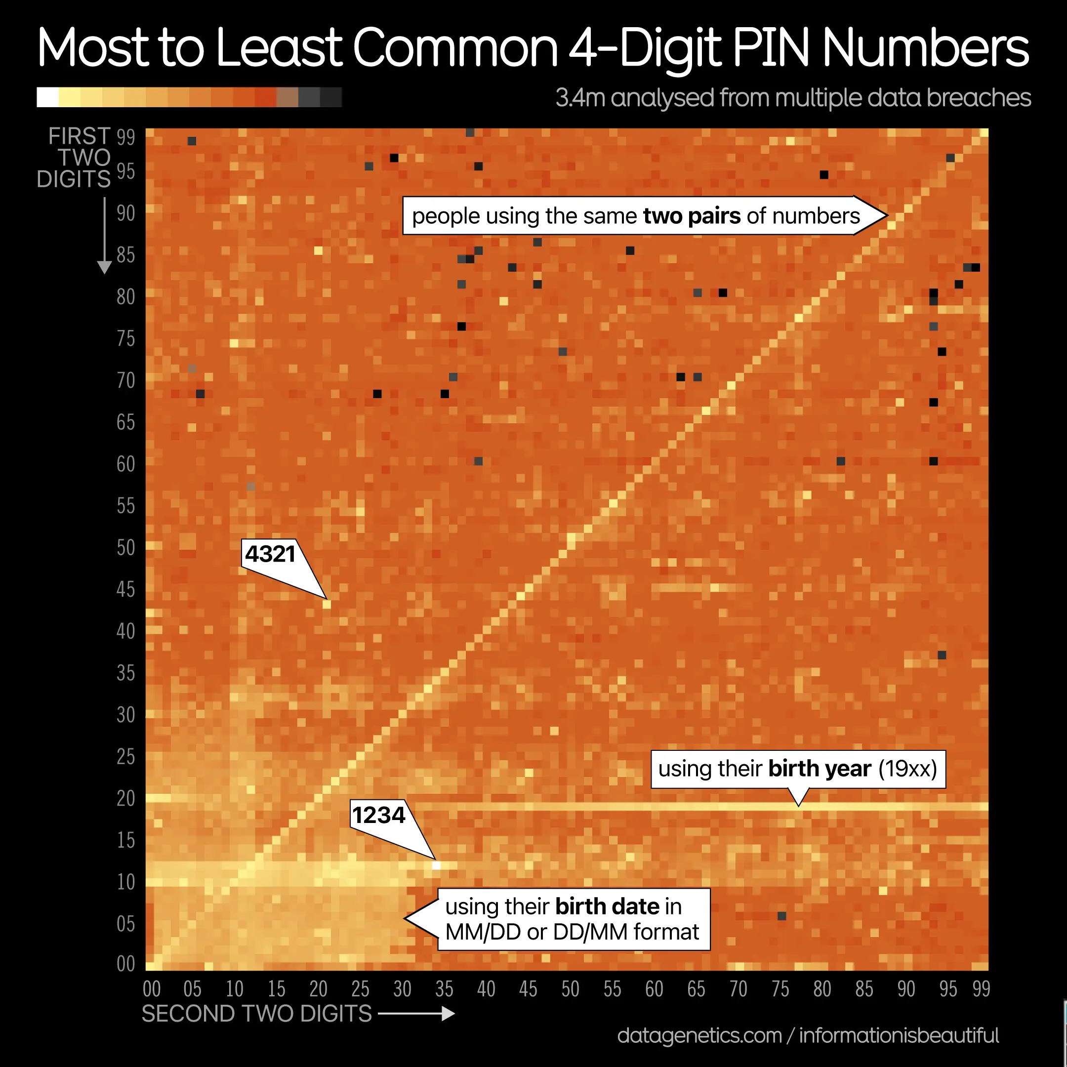
Cool visualization of user PINs that reveals human behavior patterns:
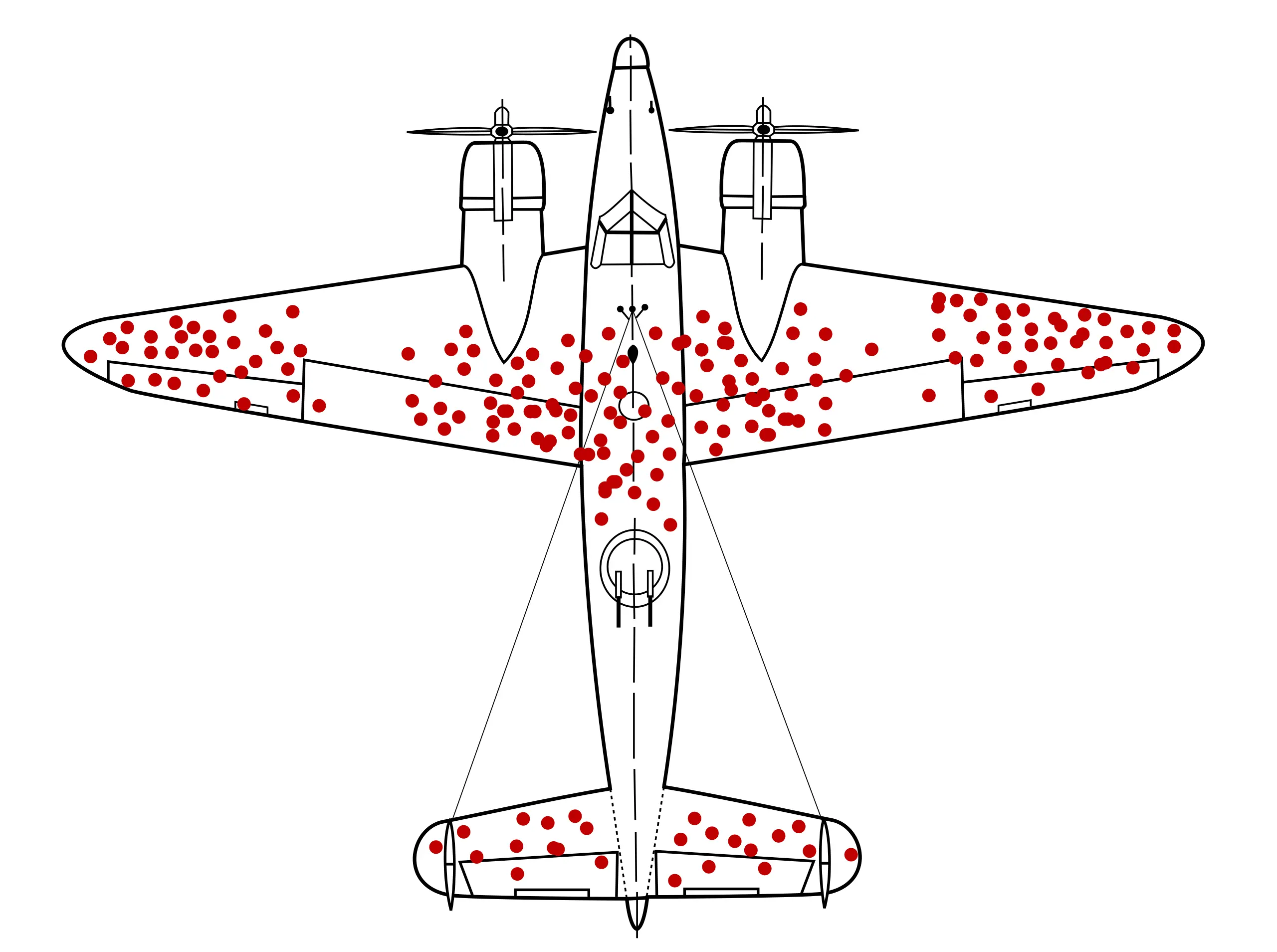
This visualization of survivorship bias demonstrates how missing data tells its own story:
Choosing the Right Chart Type
The best visualization is the one that most clearly communicates your specific message. Start with what you want to express, then pick the appropriate visual format.
Common visualization purposes:
- Comparison - Bar charts, column charts
- Trends over time - Line charts, area charts
- Parts of a whole - Pie charts, stacked bars
- Distribution - Histograms, box plots
- Relationships - Scatter plots, correlation matrices
- Geographic data - Maps, choropleth charts
For a comprehensive guide on matching message to chart type, see this excellent primer: Decide what you want to express - then pick the graph
Resources and Tools
Icon and Symbol Libraries:
- The Noun Project - Open source icons for everything
- Consistent iconography across all your diagrams
Technical Visualization:
- For code-based visualizations, see my technical visualization notes
- Mermaid diagrams for flowcharts and system architecture
- D3.js for interactive web visualizations
Design Principles:
- Keep it simple - remove everything that doesn’t serve the message
- Use color purposefully, not decoratively
- Test with your actual audience
- Iterate based on feedback
Remember: the goal isn’t to make pretty pictures, but to create understanding that leads to better decisions 📊